Do you believe the old saying, “A picture is worth a thousand words?” I certainly think the right food picture is worth a thousand words. It can make a reader drool and run right to the kitchen to try a recipe. (This is what I always want you to do.) The gotcha, though, is that it’s sometimes hard to figure out which pic you will decide is the most appetizing!
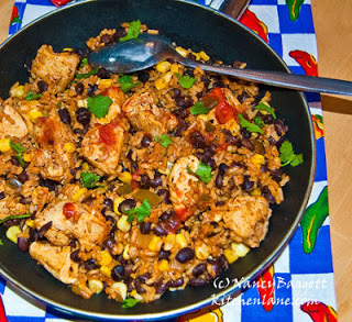
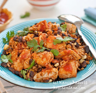
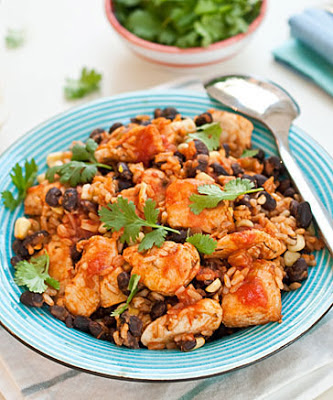
To help me answer this, please take a close look at the photo at the top, then the one at left. I’m guessing you’d rather try the dish above in the blue bowl, yes? Presumably it just looks tastier and something you’d more likely enjoy making and serving, right? But please do confirm your preference in the comments section–I’ve guessed wrong before!
In case you didn’t notice, the two photos actually spotlight the same
dish–the quick and easy chicken skillet featured below. No
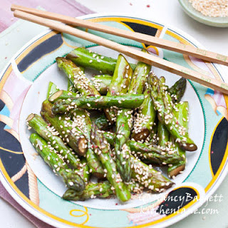 ingredients
or steps were changed. The shot at left simply shows the food in the cooking skillet; the shot above, a more recent image, shows the food put in a bowl and propped for serving. Of course, the lighting, camera angle, and composition were also changed. So, do you think the changes were for the better?
The past year I’ve been working hard on taking better food photos. For practice, I’ve been looking at older blog posts and redoing images that now strike
me as ho-hum or unappetizing. (If you’re interested in the specific
steps I took check out my very popular how-to post, “Getting to Yes on Foodgawker and Tastespotting.”)
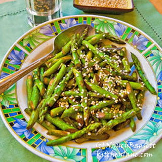
The asparagus stir-fry image above right is one of my “after” shots. The one below left was taken “before” I started upgrading my skills.
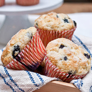 As you can see, the images are similar in many ways, yet the effects are very different. The before photo was rejected by both Foodgawker and Tastespotting, while the more recent chopsticks shot was published by both. In fact, the chopsticks pic was a Foodgawker fave the week it ran.
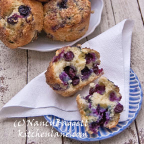
Here’s another set of my before and after photos. One blueberry muffin shot was promptly published by both Foodgawker and Tastespotting. They nixed the other, though I edited and resubmitted it several times in response to criticisms. (The muffin recipe is here.)
I’m betting you can tell which is which–the images should speak for themselves. But if you’re not sure, feel free to guess! I’ll tell you if you were right.
At the moment, I’m happy to see some progress, and hopefully, you can see it from the comparison shots, too. But the learning process is still just beginning, so tune in again soon to check out the latest pics.
Chicken Skillet Pronto
The dish not only goes together quickly, but total cooking time is short. Carrot and celery sticks or a simple salad and perhaps a fruit dish or bread can round out the meal.
Tip: For even quicker preparation, substitute a time-saver package of cubed chicken breast meat for the breast halves. And to boost fiber, use instant brown rice instead of white rice; it’s a very convenient “healthy” whole grain product. (Don’t try to sub regular brown rice–it takes way too long to cook.)
1 tablespoon olive oil or canola oil
1 pound boneless, skinless chicken breast halves, cut into 1 inch cubes
1/2 teaspoon dried thyme leaves
1/2 cup mild or medium-hot bottled picante sauce or salsa
3/4 cup (uncooked) “instant” (or “5 minute”) brown or white rice
2/3 cup reduced-sodium chicken broth or water
1 can (14-15 ounces) black beans, well rinsed and drained
2/3 cup frozen (thawed) corn, rinsed and drained, optional
Black pepper to taste, optional
Chopped fresh cilantro or parsley leaves, optional
In a 12-inch nonstick skillet over high heat, combine the oil, chicken and thyme leaves. Cook, stirring, 3 or 4 minutes, until chicken pieces begin to brown. Stir in the picante sauce or salsa, adjusting heat so mixture simmers gently; cook 3 minutes longer. Add rice, broth (or water), beans, and the corn, if using. Let return to a simmer.
Continue simmering gently, covered, for 8 to 10 minutes, until the chicken and rice are just cooked through. (Brown rice will take a little longer than white.)
Fluff with a fork before serving. Season with pepper, if desired. Garnish with a little more salsa and chopped cilantro or parsley leaves, if desired. You can serve extra salsa at the table, but probably shouldn’t if you’re trying to lower your family’s sodium intake.
Makes 4 servings.
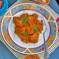
For another dinner-in-a-hurry idea, check out my quick chicken curry, here.

Erin, I have found that, as you say, the colors in the blue/green range can often give food an odd unappetizing color. This is partly because, yes, the dishes do reflect against the food. It takes careful photography to avoid this problem. In this case, I made a point of pairing the blue with a strong, complementary orangish colored food–which I felt was strong enough not to get washed out by the blue bowl.
I feel like a party pooper in saying this, but I find food unappetising in and around cool colours (green, blue, purple). There is a psychological advantage to warmer colours: they subconsciously trigger hunger and intenser emotions. This is why a lot of restaurants use reds, yellows, and browns in their decor. So to me, even though the food was ready to go in the blue plate, I find the skillet picture far better.
Also blue kind of gives the food an odd blueish colour because of it reflection.
To each their own, but there is a lot to be said about colour psychology!
Ruth and Toby–the photo gods picked the one you preferred–the basket of muffins, rather than the one opened. They didn't like the lighting or the composition of the one with the muffin opened up. I still think it's pretty appetizing though.
Difference is noticeable. The chicken is much more appetizing in the bowl–pieces appear larger and more balanced with other ingredients. Asparagus with chopsticks is better. I much prefer the muffins whole rather than broken apart, but I understand if editors want their readers to see interior.
I went back and looked at the muffins. the one I actually like best is the top one. I was guessing we'd want to see the interior. oh well
I can tell the chicken in the dish is better than in the skillet. And I can tell the chop stick asparagus dish is better than the other one. I'm not so sure about the muffins. I have to guess that the one w/ the opened muffin is better. But I can't be sure.
Thanks for the great feedback. Interesting that you didn't mind the "before" pics of the asparagus and muffins. The food pic sites didn't like either the lighting or the composition of my first submissions. Sometimes I get what they don't like–sometimes I think the shot is fine. It IS subjective to a point!
I can definitely say I agree with the first example. The other two, less so. The main difference I see with the two last examples is lighting – but it's not as if the lighting in one image is horrible…it's just not quite as good. Anyway, nice work!